Peter Knippel
Garden Centre
Brand Redesign
The Challenge
The original logo was outdated and cropped, making it challenging to represent the garden centre’s fresh and vibrant identity. With the business located in a growing neighborhood surrounded by new homes and schools, a refreshed brand was needed to connect with both loyal long-time customers and new residents.
The key goals or requirements
- Create a recognizable garden centre identity.
- Develop a modern and friendly look.
- Appeal to a wide age range without being too playful or complicated.
- Stand out to attract new customers.
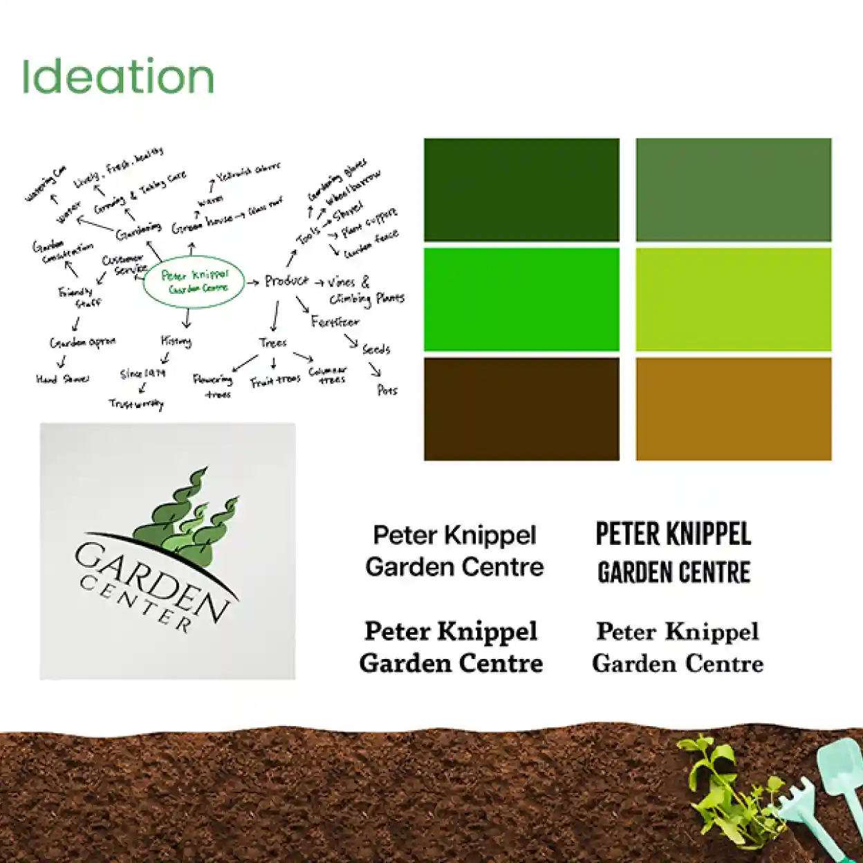
the process
- Ideation- Mind map & Moodboards
- Initial Sketches: Exploring Concepts
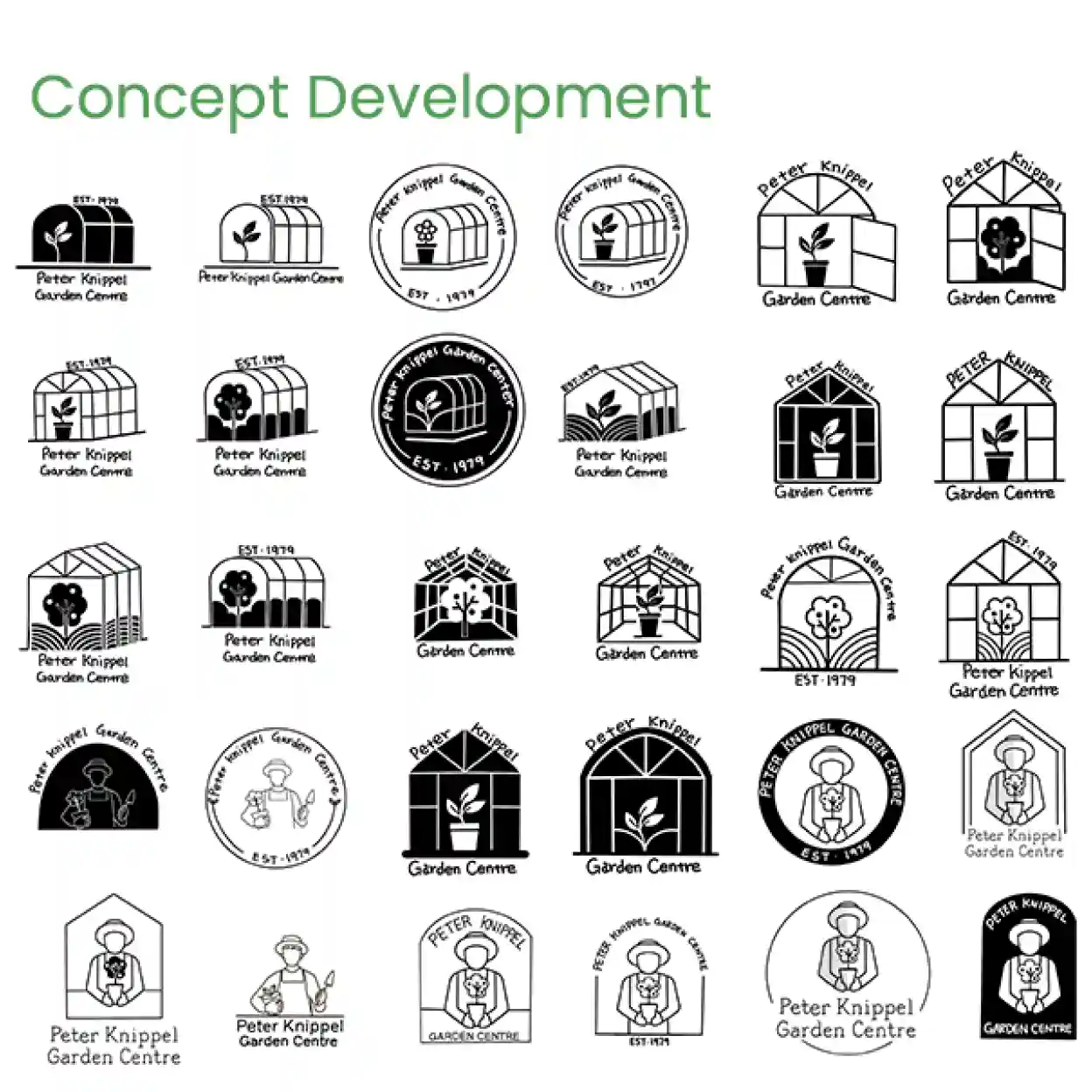
- Concept Development: Refining Two Key Ideas
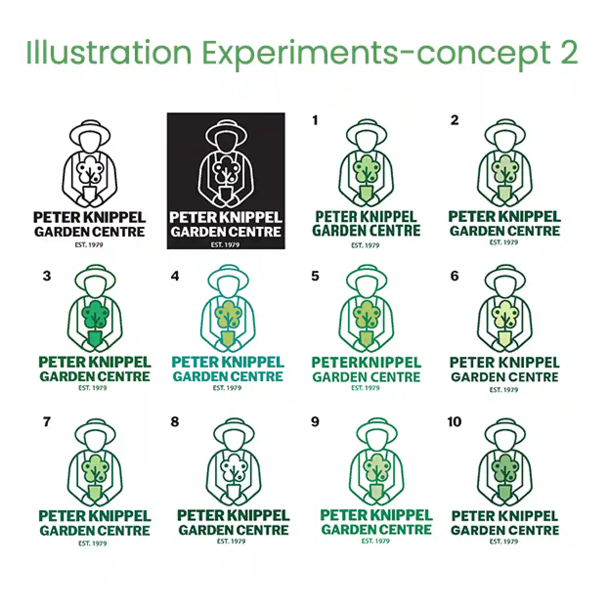
- Illustration Experiments: Colours & Logo Variations


The Solution
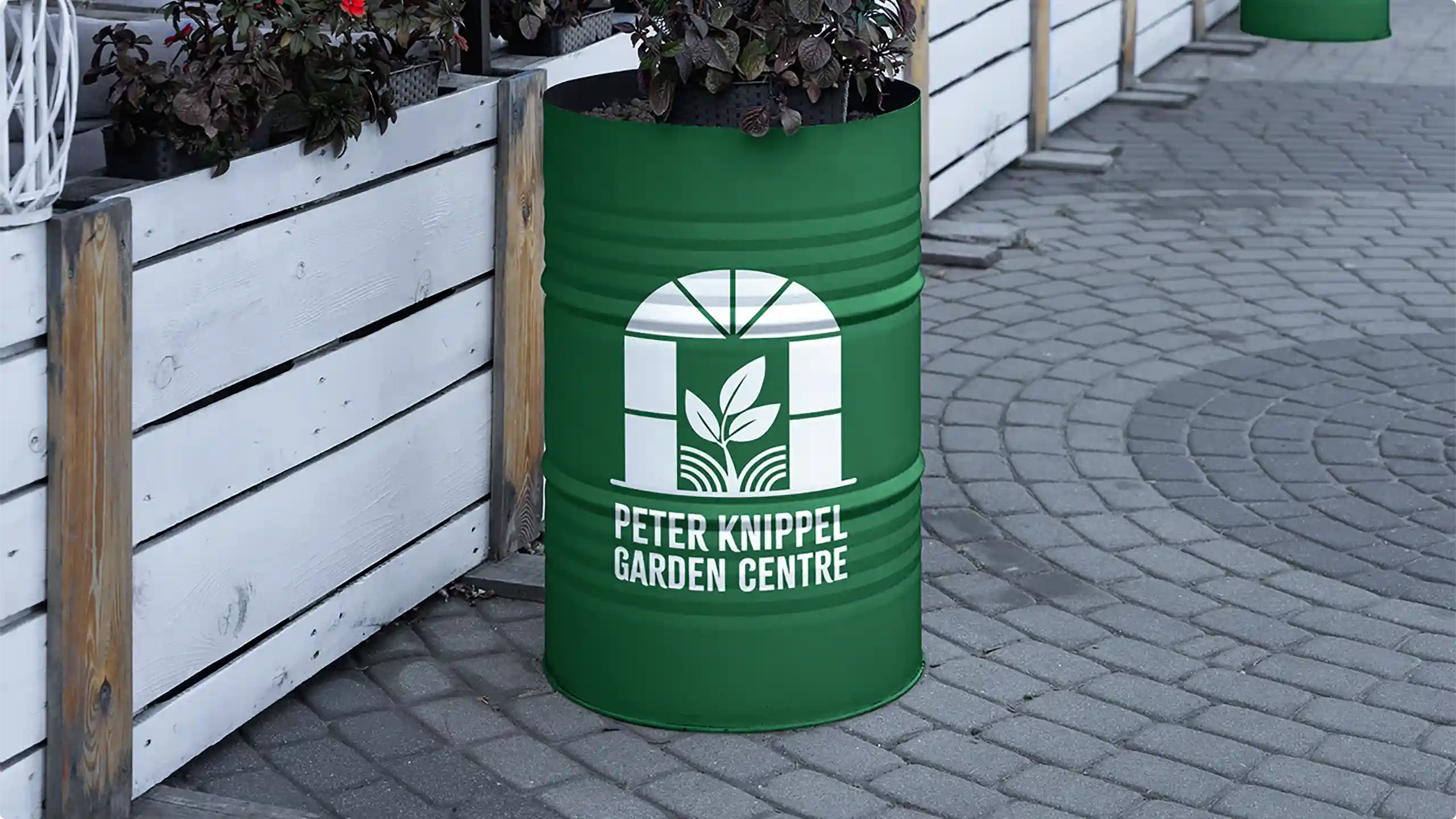
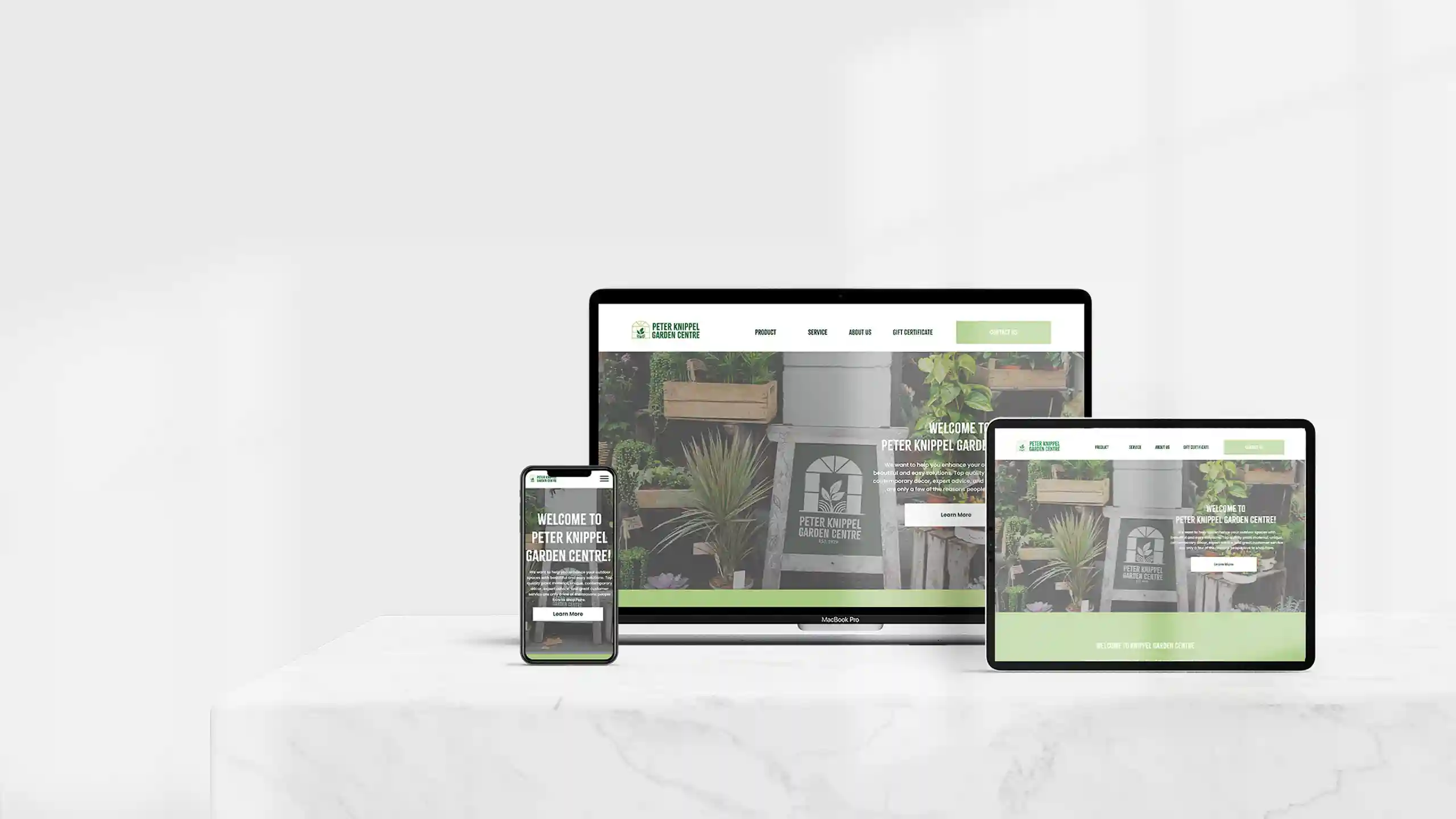
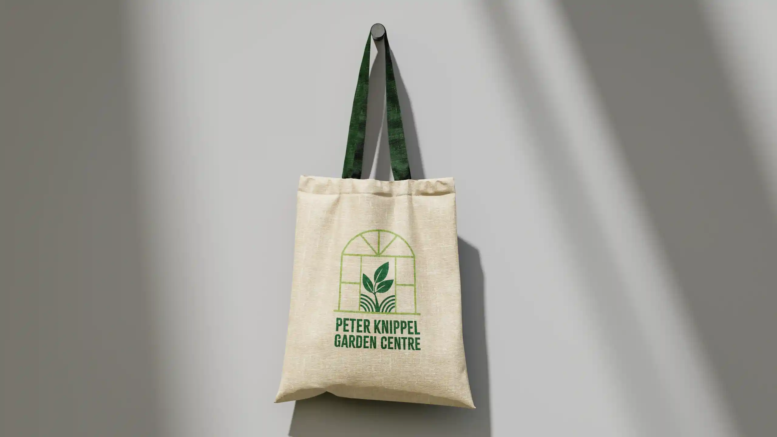
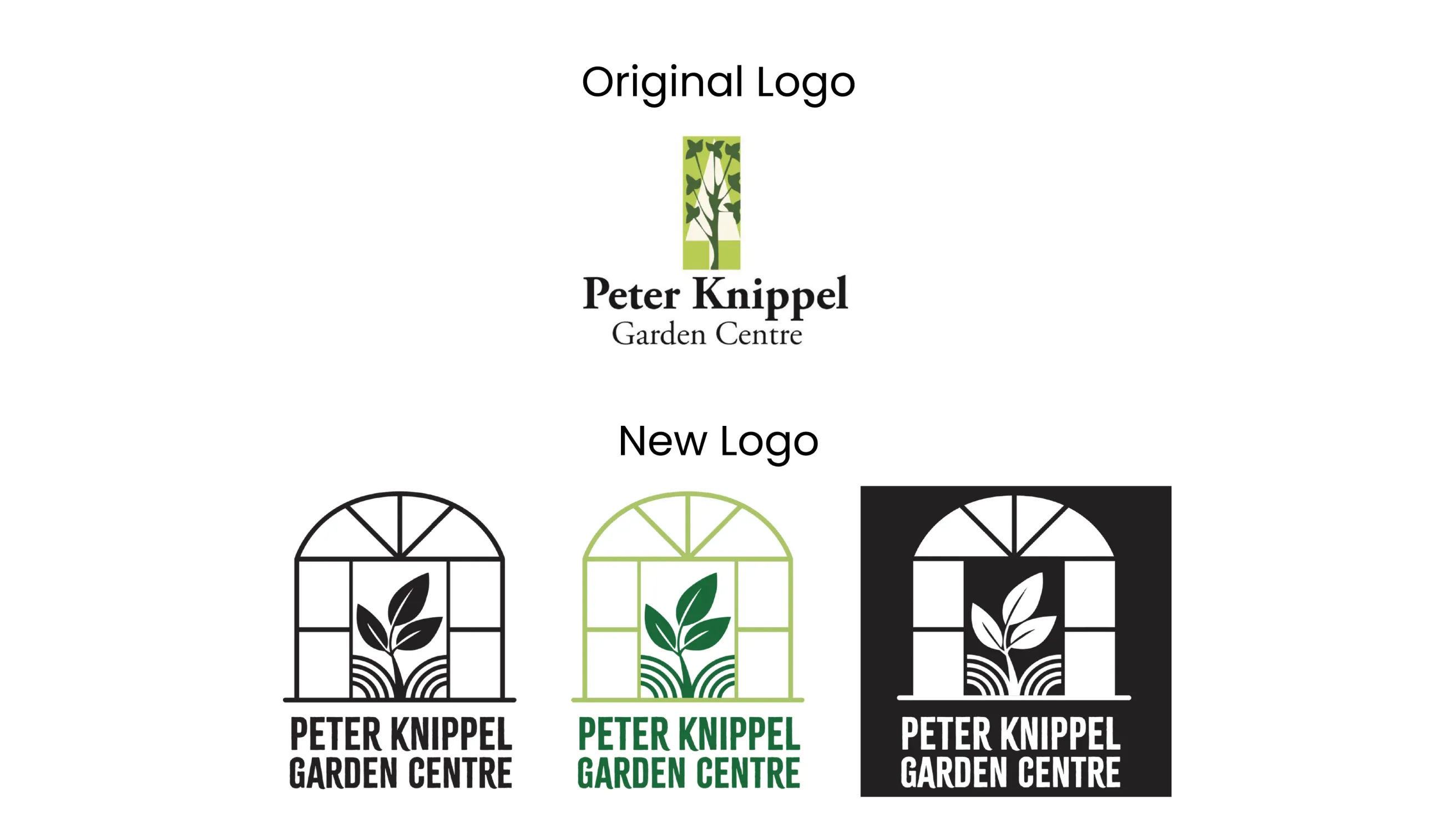
To convey freshness and vitality, the redesigned logo emphasizes clean lines and a modern aesthetic. Compared to the original, the new mark clearly communicates the garden centre’s identity at a glance. Paired with a refreshed colour palette, the new website design maintains the brand’s approachable tone and creates a cohesive, welcoming experience for all audiences.
Final Outcome
Through this process, I learned how a brand can set its tone and identity across all touchpoints. From logo to website, every element must remain consistent and visually convey the brand’s values. I also realized that as a graphic designer, my role is not only to create something that looks good but also to understand the brand’s vision and help strengthen its identity through design.