.webp)
Beer can label design
The Challenge
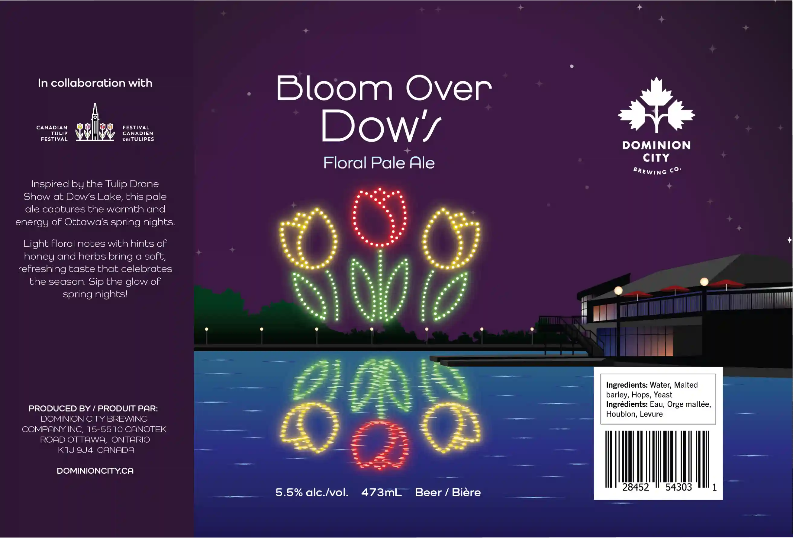
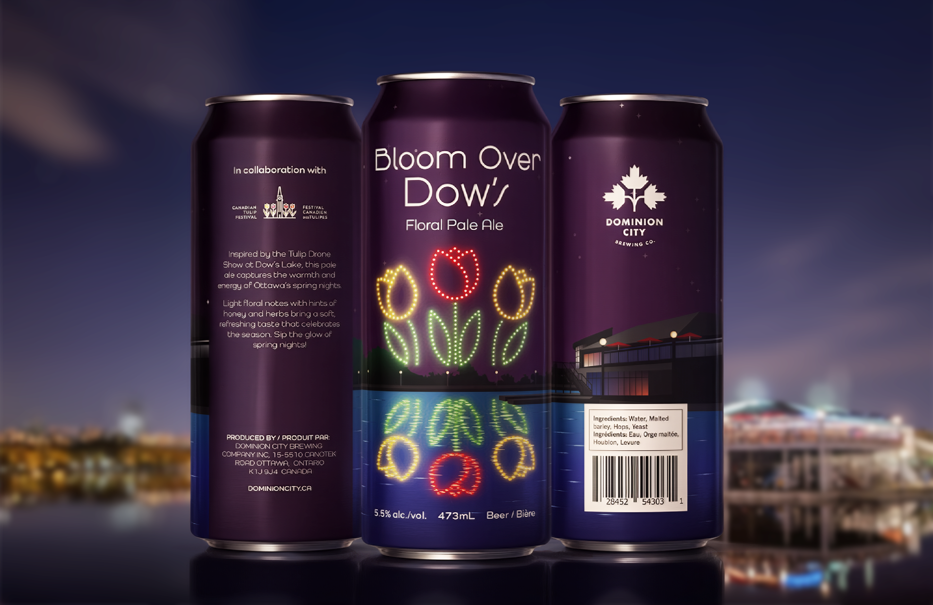
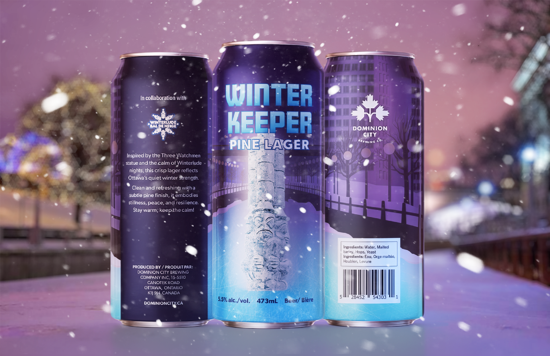
Dominion City Brewery has a clean and modern visual style, so I wanted to create seasonal beer labels that bring a fresh look to the brand while reflecting the atmosphere of Ottawa’s seasons. My goal was to design two labels, one for spring and one for winter, that capture the feeling of each season and connect to meaningful Ottawa landmarks or experiences.
The Solution
I developed two concepts inspired by real Ottawa experiences. For spring, the design is based on the Tulip Drone Show at Dow’s Lake, creating a warm and glowing atmosphere. For winter, the idea combines the calm mood of Winterlude with the symbolic strength of the Three Watchmen statue, illustrated as an ice sculpture. Both designs include Ottawa landmarks, colour moods, and lighting effects to make each label feel authentic and atmospheric.

Final Outcome
Through this process, I learned how to design layouts that fit different moods and how to bring local Ottawa elements into my work in a meaningful way. It helped me understand how design can connect a product to a place and create a stronger story for the audience.
Marketing Campaign video
To promote the two beer cans, I created Instagram Reels for the marketing campaign. For the spring beer, I wanted to create a glowing, warm, and lively look and feel. For the winter beer, I wanted to show a peaceful and strong mood. I used After Effects to create these Instagram Reels.