Ben’s Original dried rice sustainable packaging
The Challenge
The primary challenge was to redesign the packaging in a way that enhances usability, convenience, and sustainability while maintaining the product's attractiveness on the shelf. The new design needed to support both individuals and families looking for simple, portioned rice options. The key goals or requirements
- Create a more convenient packaging system with easy portion control.
- Add user-friendly features such as measurement lines and a pouring spout.
- Ensure the packaging is both portable and practical for use at home and outdoors.
- Make the design visually distinct for each flavours while keeping a cohesive look.
- Incorporate sustainable materials (e.g., compostable windows, reduced plastic use).
- Strengthen the brand’s modern and approachable identity through thoughtful design.
the process
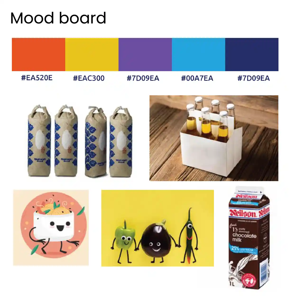
- Ideation- Mind map & Mood boards
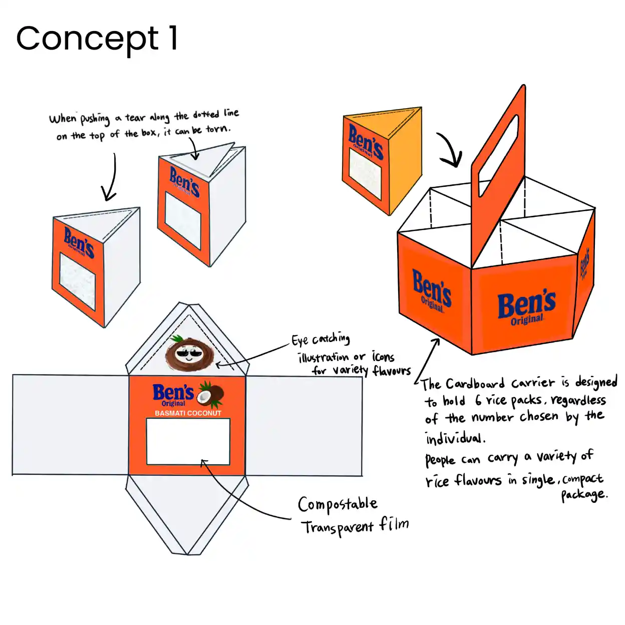
- First Concept Sketches
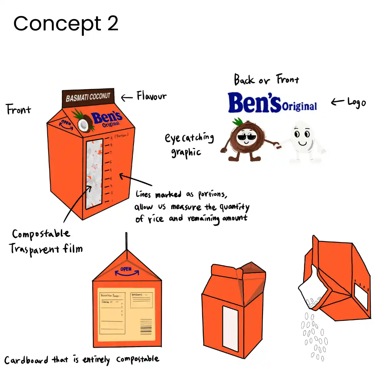
- Second Concept Sketches
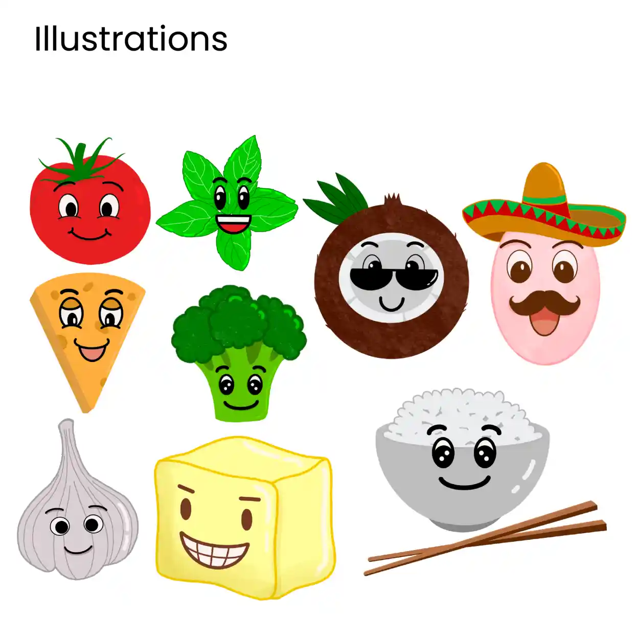
- Illustrations for different flavours
The Solution
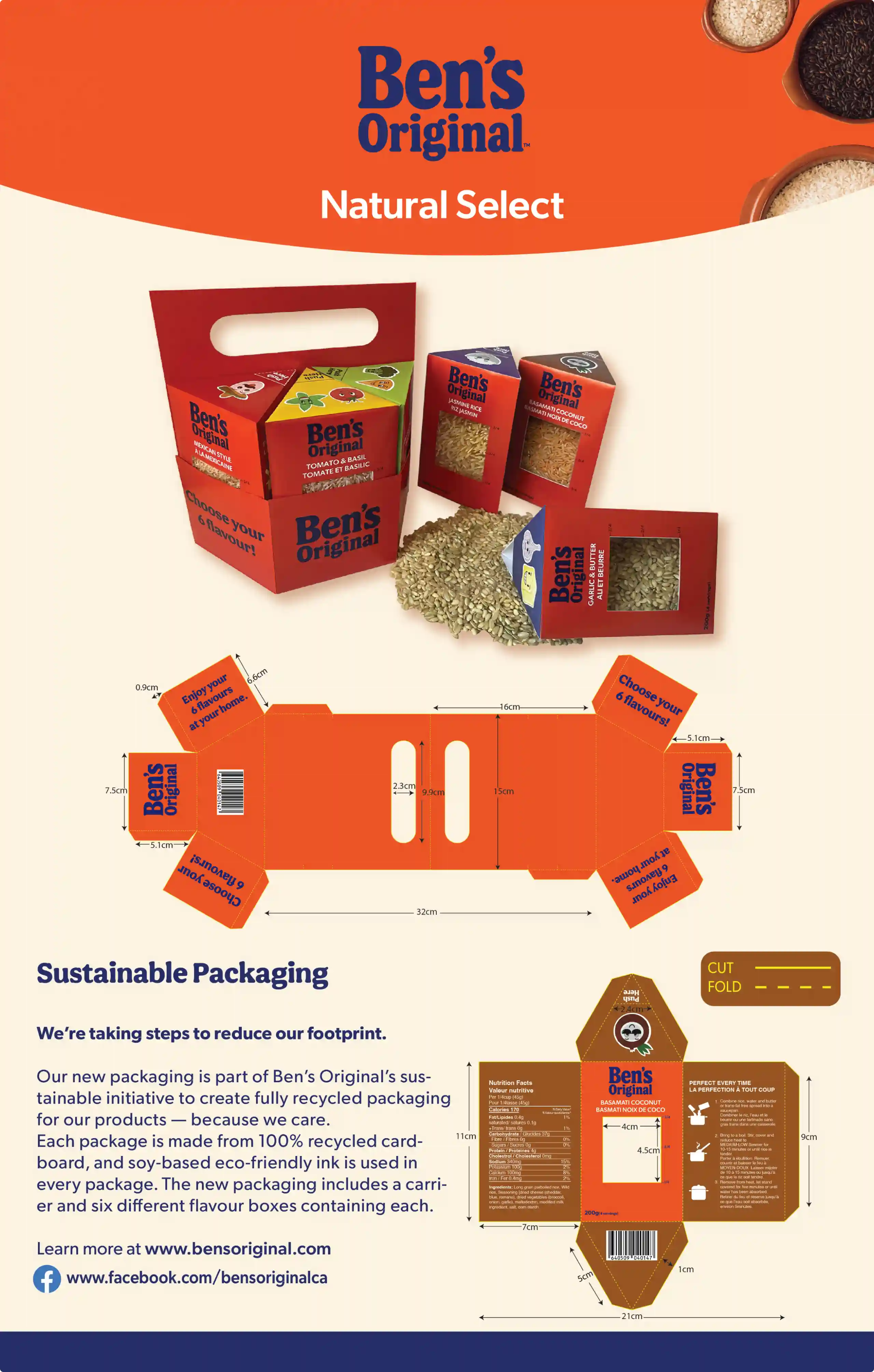
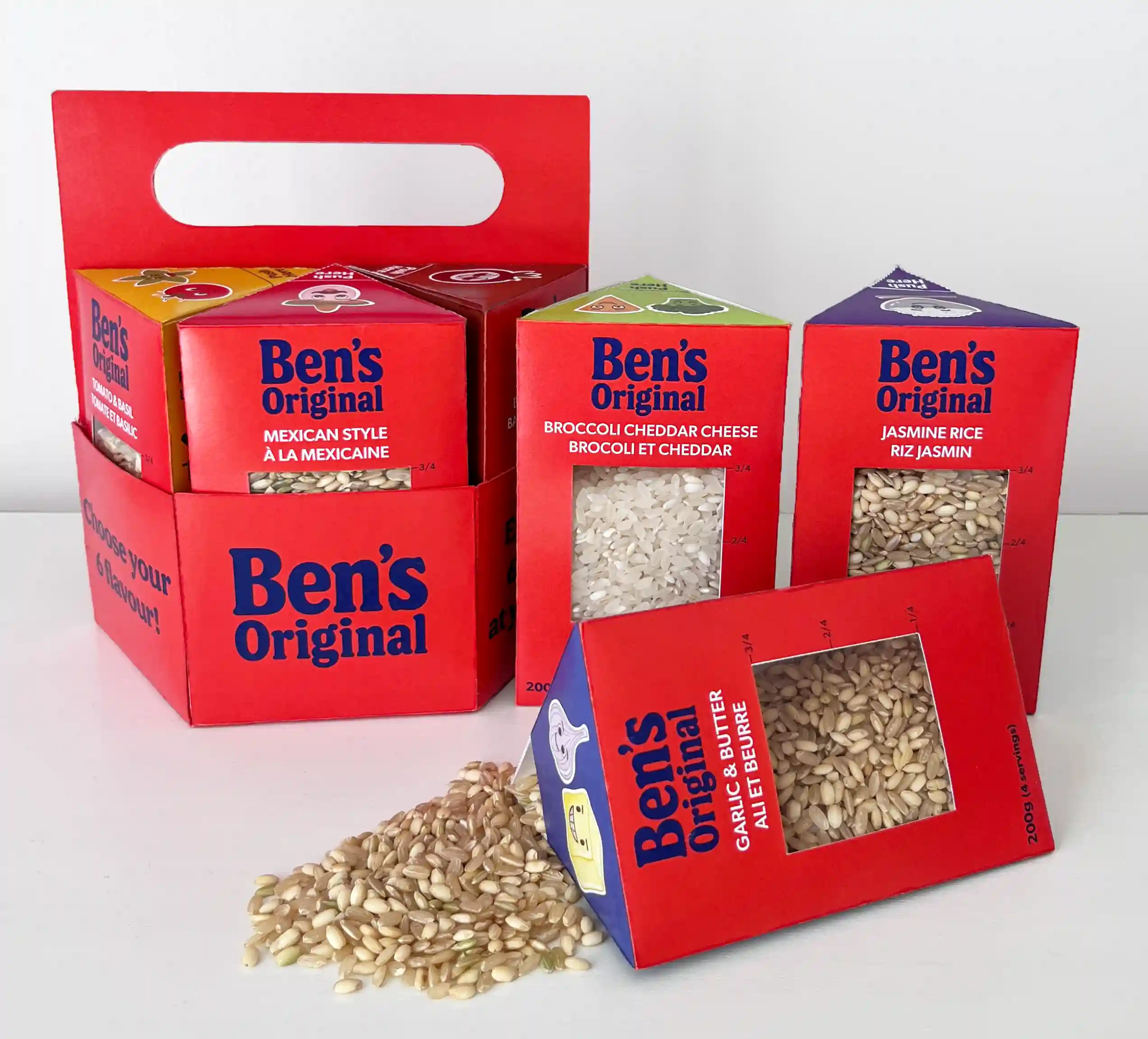
I developed two concepts to improve the design, and the most effective one was selected for the final solution. The redesigned concept introduces six triangular boxes, each representing a different rice flavour, which fit neatly into a hexagonal carrier for easy storage and portability. Each box features:
- A compostable window to showcase the rice inside
- Measurement lines for easy portioning without extra tools
- A spout for simple, mess-free pouring
This design combines sustainability with convenience, reducing waste while enhancing usability and creating a packaging system that feels modern, practical, and customer-focused.
Final Outcome
This redesign transformed the product from bulk plastic bags into a modern, eco-friendly system that is both practical and appealing. I learned how packaging design can directly impact usability and sustainability, and how thoughtful details such as portion guides and portability add real value for customers. This project reinforced the importance of balancing functionality, visual appeal, and environmental responsibility in packaging design.